Madam G
Modern Indian Restaurant
Details
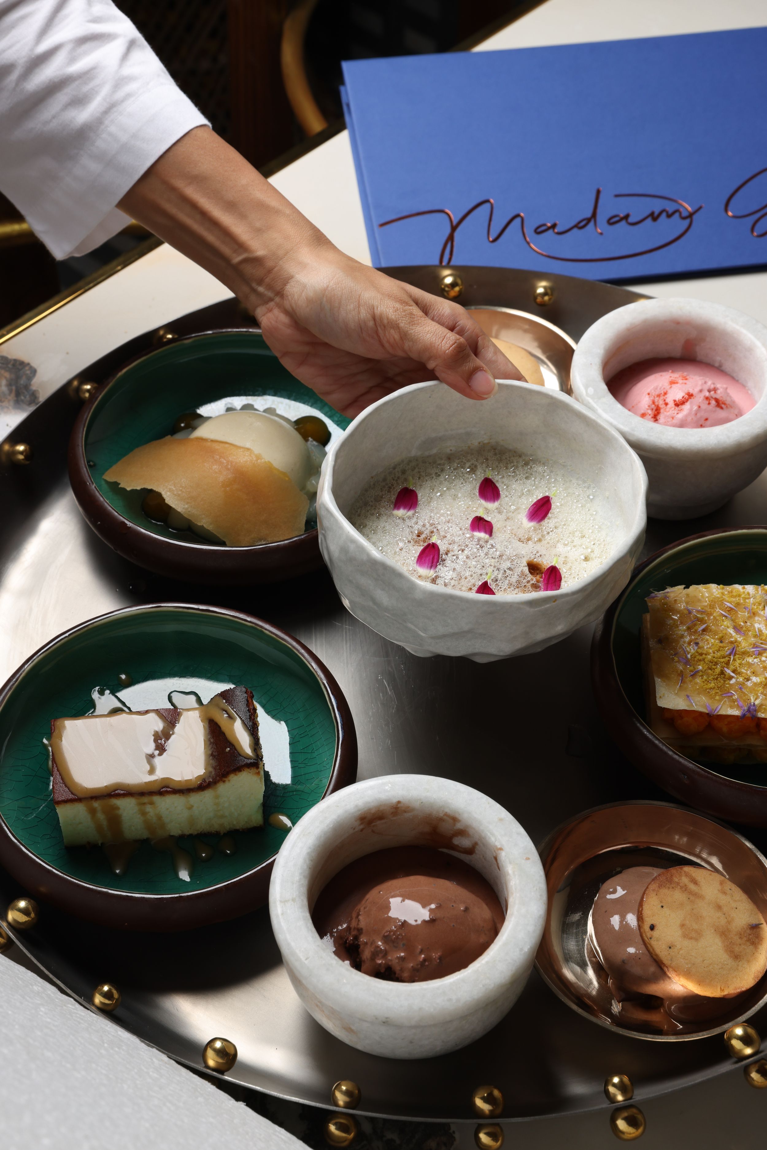
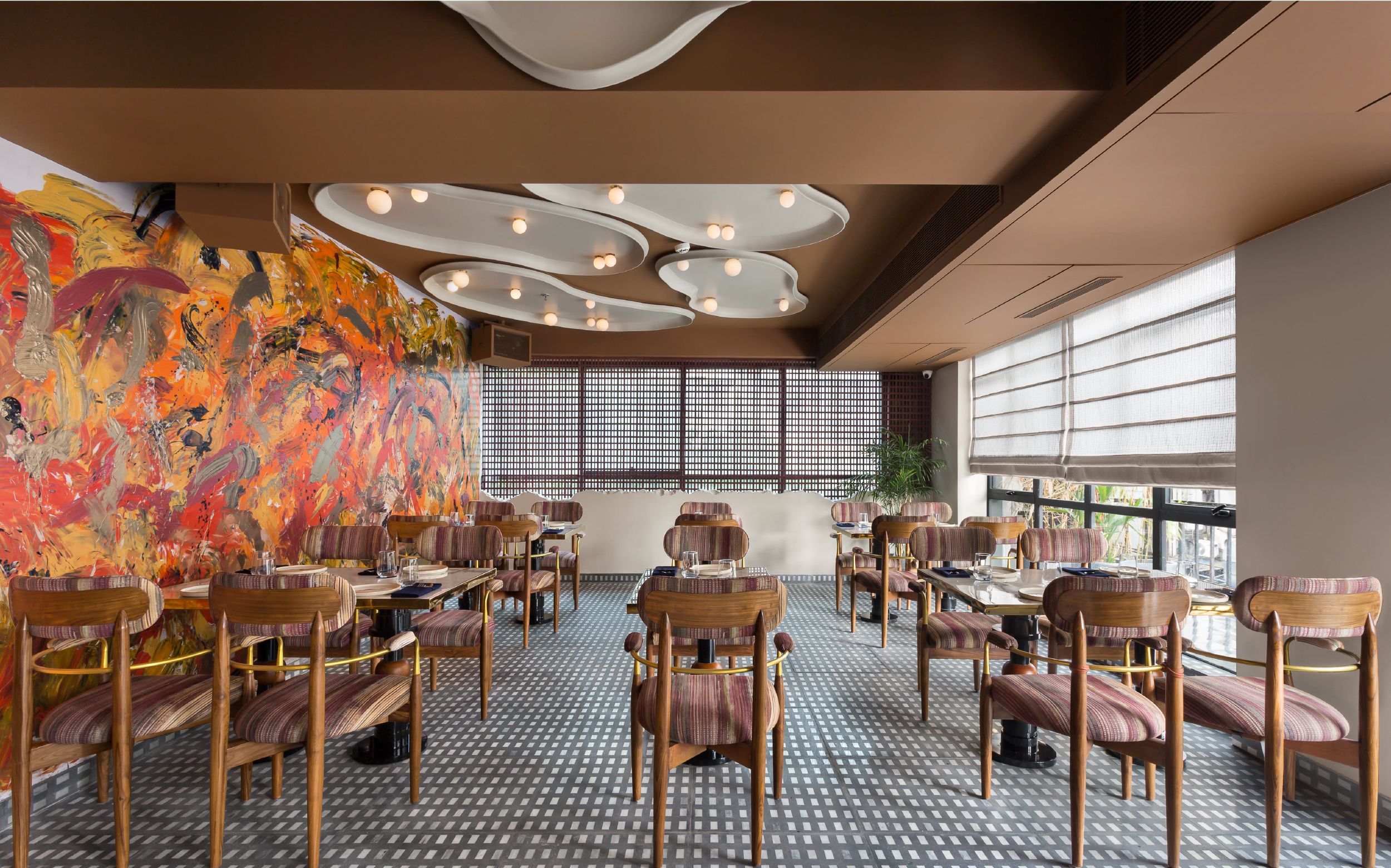
Madam G's true identity stays classified. Her restaurant, however, is on record: unmistakably Indian, effortlessly international, allergic to cliché. The identity, narrative, and packaging all orbit this one magnetic character.
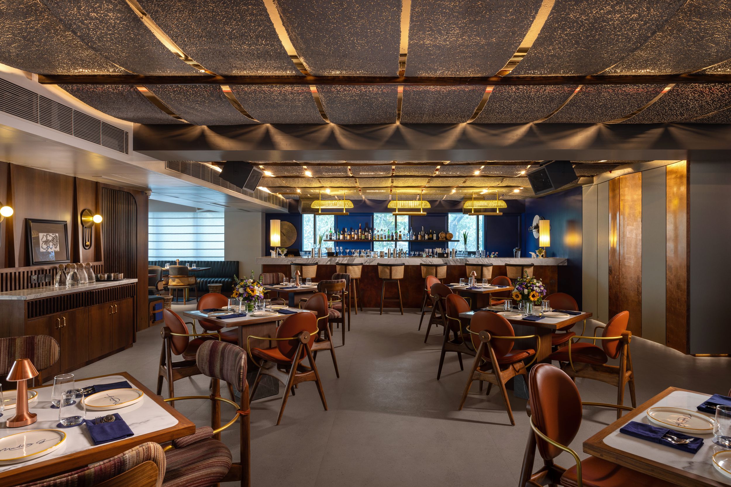
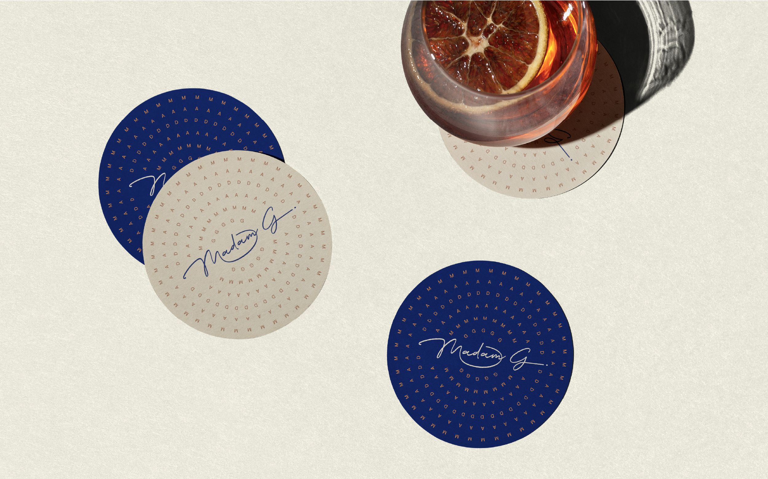
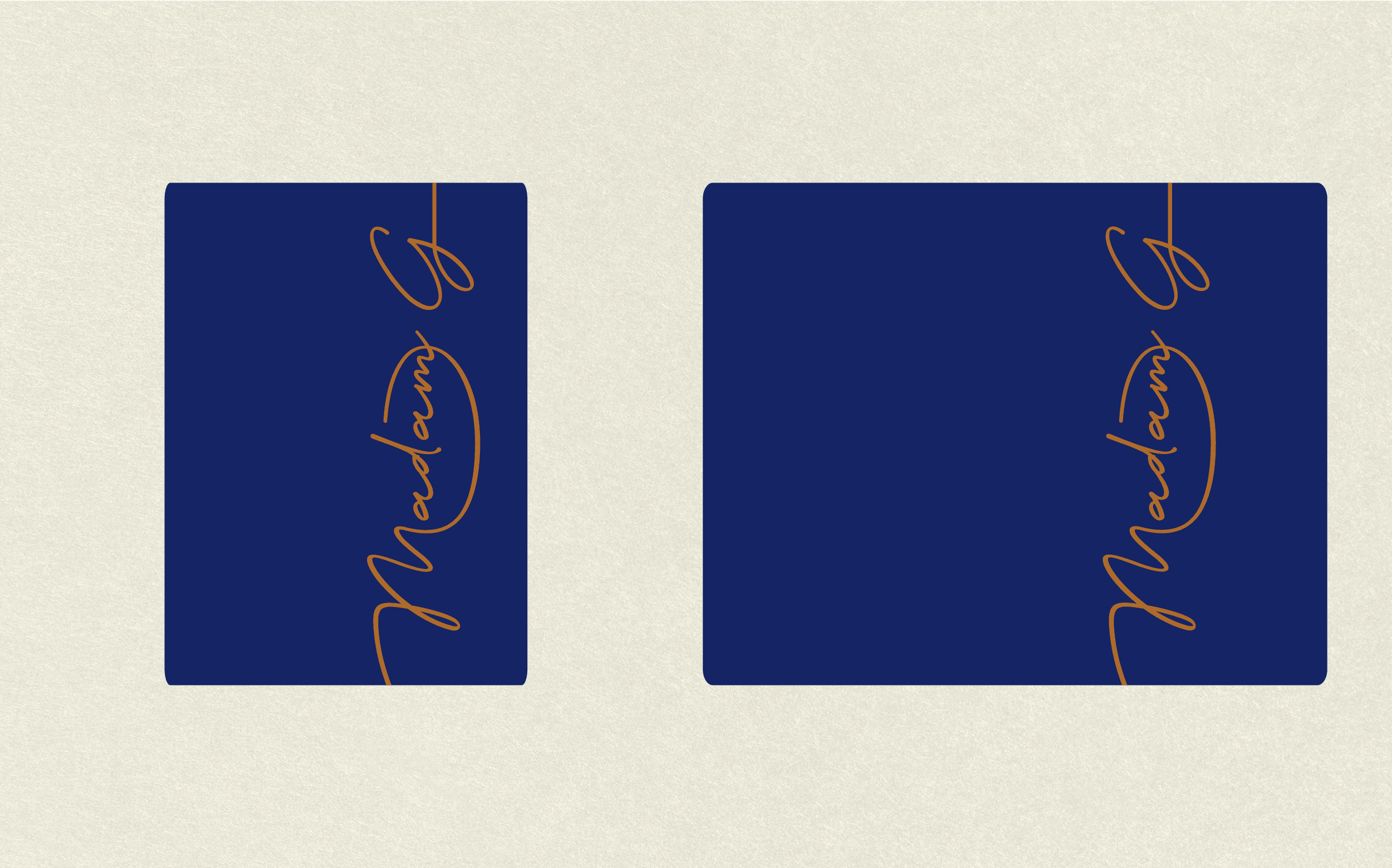
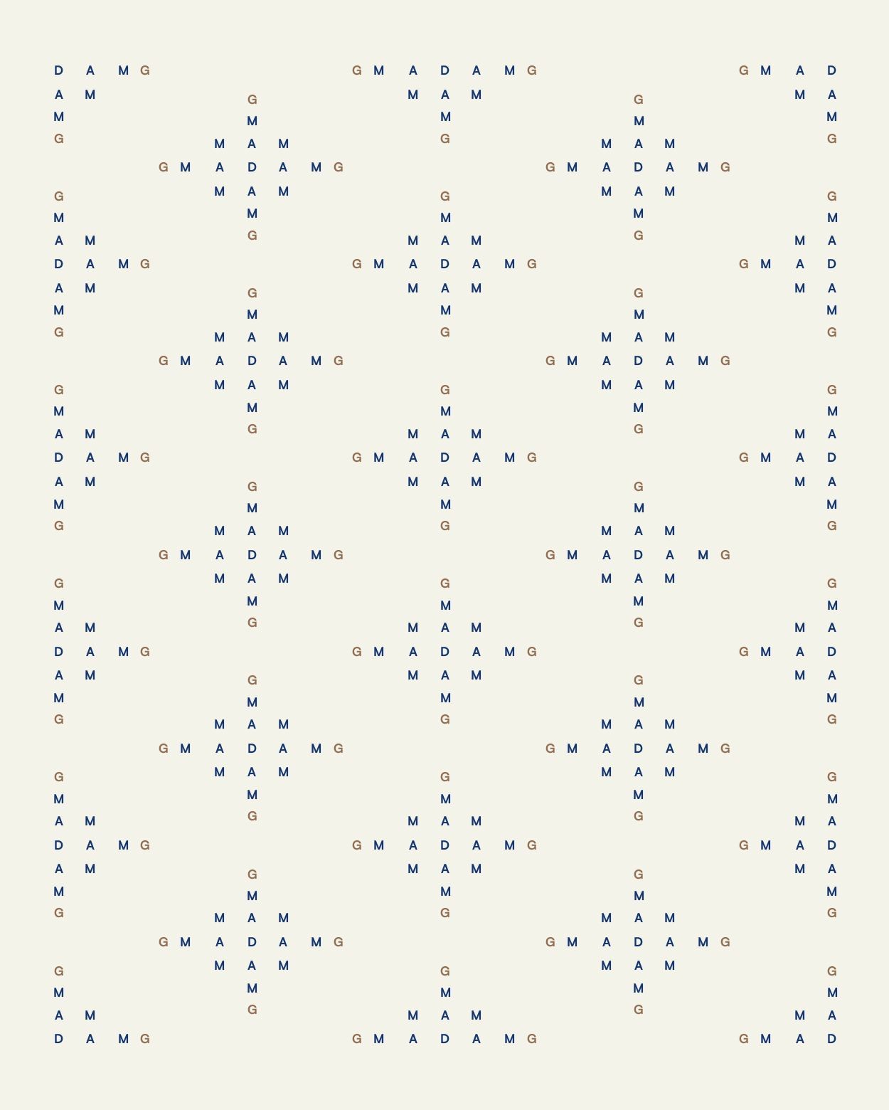
Restraint won over gimmickry. Deep ink blue trimmed with copper sets the stage where grandmother's recipes meet a gallery's eye.
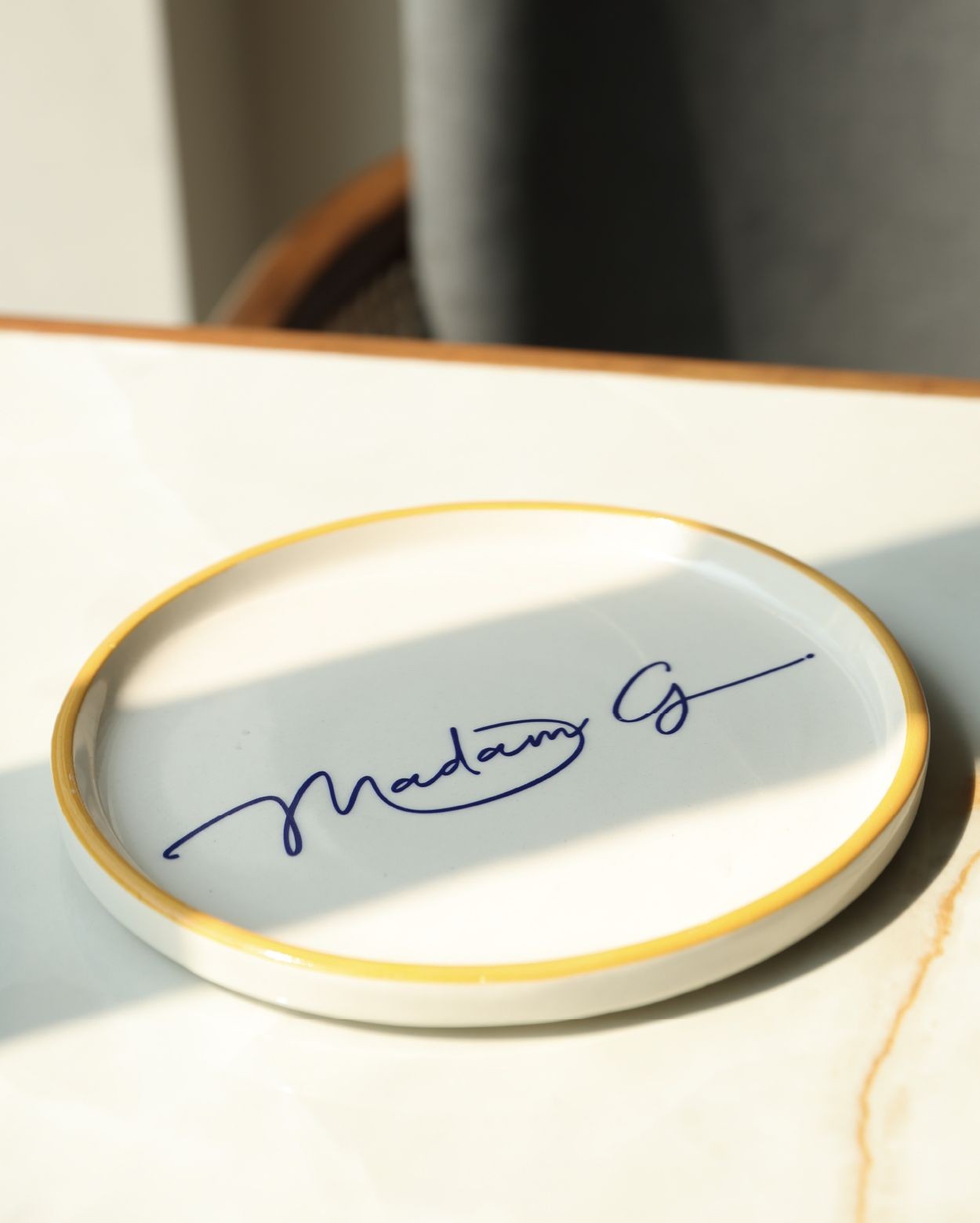
Her presence surfaces in script-like lettering, sayings attributed to the lady herself, and dispatches from her travels through India's kitchens. Sweet tins themed to different cities, each coloured after its hometown, moved off the shelf and into the interiors as decor. Somewhere in the heart of Kolkata, her table is set; the mystery is the invitation.
Services
Brand Identity
Packaging Design
Year
0223
Agency: AGENC
Creative Direction: Harjot Singh, Anuradha Thirani
Design: Harjot Singh